14 KIT
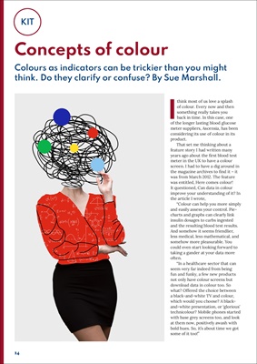
Concepts of colour
Colours as indicators can be trickier than you might
think. Do they clarify or confuse? By Sue Marshall.
I
think most of us love a splash
of colour. Every now and then
something really takes you
back in time. In this case, one
of the longer lasting blood glucose
meter suppliers, Ascensia, has been
considering its use of colour in its
product.
That set me thinking about a
feature story I had written many
years ago about the first blood test
meter in the UK to have a colour
screen. I had to have a dig around in
the magazine archives to find it - it
was from March 2012. The feature
was entitled, Here comes colour!
It questioned, Can data in colour
improve your understanding of it? In
the article I wrote,
"Colour can help you more simply
and easily assess your control. Piecharts
and graphs can clearly link
insulin dosages to carbs ingested
and the resulting blood test results.
And somehow it seems friendlier,
less medical, less mathematical, and
somehow more pleasurable. You
could even start looking forward to
taking a gander at your data more
often.
"In a healthcare sector that can
seem very far indeed from being
fun and funky, a few new products
not only have colour screens but
download data in colour too. So
what? Offered the choice between
a black-and-white TV and colour,
which would you choose? A blackand-white
presentation, or 'glorious'
technicolour? Mobile phones started
with base grey screens too, and look
at them now, positively awash with
bold hues. So, it's about time we got
some of it too!"